HumanKind
A mobile platform that facilitates voucher-based donations without the need for cash or a bank account!

Project Duration: 4 months
Team: 5 UX Designers/Researchers
My Role: UX Designer & Researcher
P R O J E C T O V E R V I E W
Problem
How can we facilitate quick and transparent donations from people who don’t carry cash towards people in need?
Outcome
We designed an app where people in need can post wishlists requesting grocery, clothing, or hygiene items. Donors can make voucher-based donations to fulfill those wishlists.
P R O J E C T C O N T E X T
Problem Context
We noticed that a lot of individuals ask for money or food on the streets, but hardly anyone stops to help or give.
From people who are sympathetic we heard reasons such as:
“No one carries cash anymore.”
It made us curious about how to address barriers that might be stifling generosity.
S O L U T I O N P R E V I E W
A Wishlist-based Mobile Donation Platform
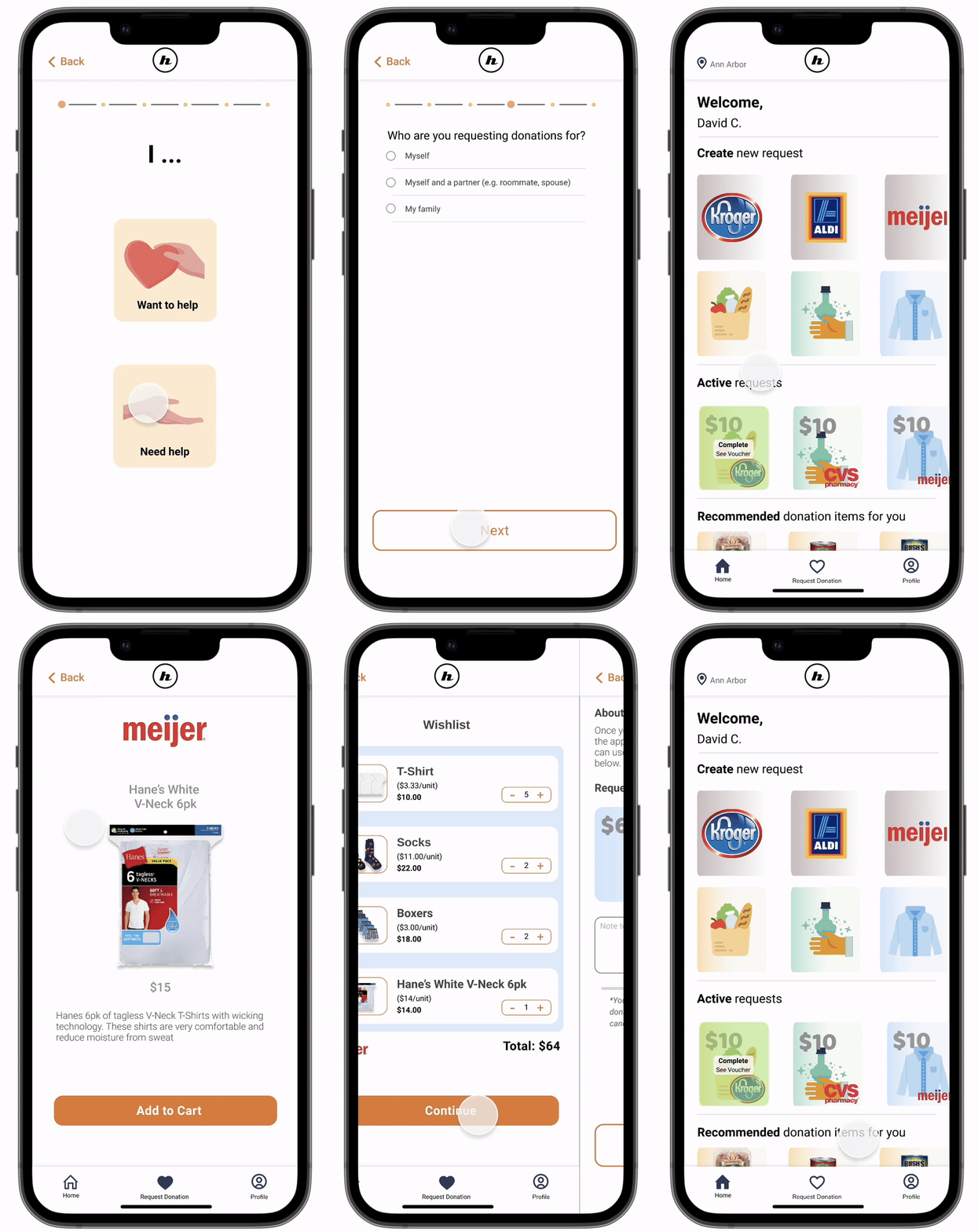
Requestors
Requestors can post public wishlists up to $200/month for grocery, clothing, or hygiene items.
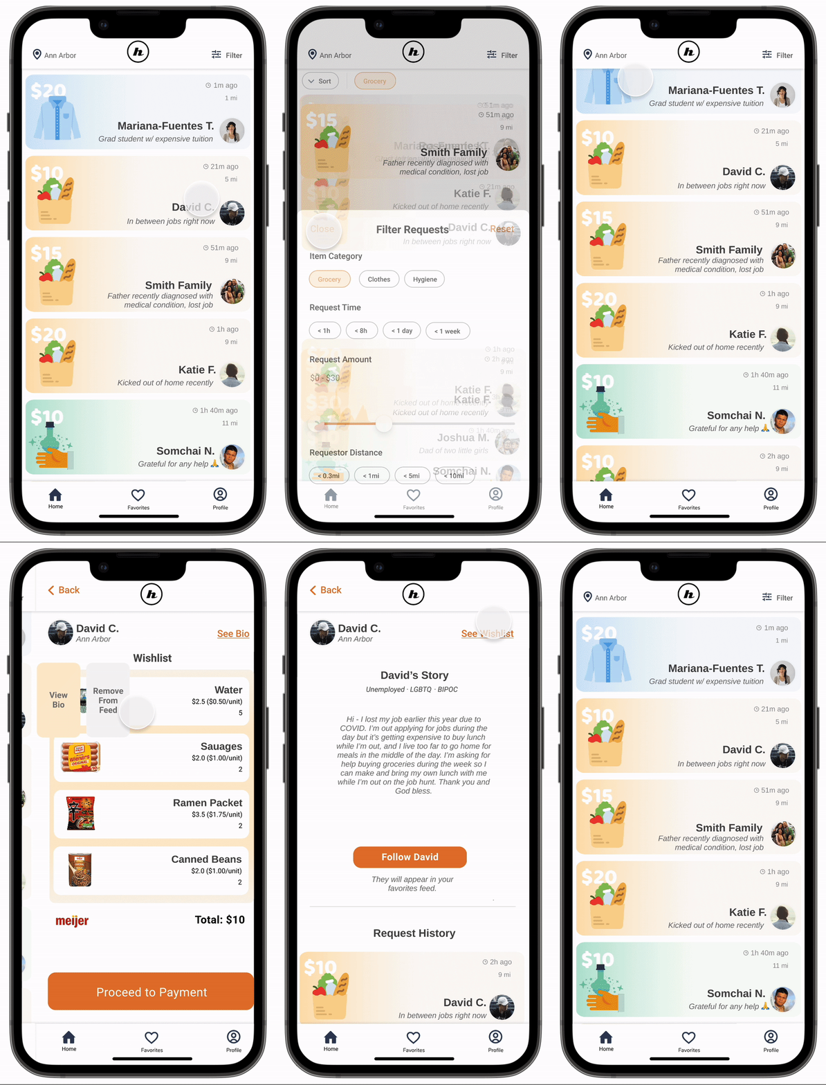
Donors
Donors can make voucher-based donations to fulfill wishlists posted by people in their area.
Design Process
Discovery
User Interviews
Competitive Analysis
Define
Target Users
Beneficiaries
Ideation
Sketches
Brainstorming
Product Requirements
User Flow
Prototyping
Paper Prototype
Wireframes
High-fidelity Prototype
Testing
Usability tests
0 1 | D I S C O V E R Y
User & Competitor Research
1. Understanding Donors
What did people prioritize in their donation process?
We interviewed 12 people with a history of making monetary and non-monetary doations.
Sample Interview Questions
“Can you walk me through the last time you made a donation?”
“What is your reaction when someone on the street asks you for money?”
What donors value:
Comfort
Willing to assist people who ask for help, but many prefer not to interact with strangers in person due to fears around unpredictability, hygiene, and personal safety.
Convenience
Willing to make quick donations to people they meet but they often don’t carry cash and aren’t willing to go out of their way into a store to buy stuff for others.
Simplicity
Don’t want to research different charitable organizations or manually input repetitive information across donation sites because it was too much effort.
Transparency
Wanted to know how the money they donated would be spent. Specifically, they wanted reassurance that their donations would go towards something necessary and impactful.
2. Understanding Requestors
What is the best way to assist people who are not being helped by existing donation methods?
We interviewed 3 unhoused individuals.
Sample Interview Questions
“Which resources are the hardest to come by?”
“What items are most helpful to you?”
Constraints for Requestors:
Location Matters
People want to be able to safely access their aid from a nearby location.
Optional Access to Technology
People could access computers or phones through libraries or the government but did not necessarily see the need to do so.
No bank accounts
People did not have access to bank accounts.
Desire for more Communication
People get help from shelters, pantries, and churches but rarely get to request their specific needs to donors.
3. Competitive Analysis
Few competitors connected donors directly with individuals that needed help. Most came with some layer of bureaucracy, wait, or opacity.
Recipients with poor mobility, time-sensitive needs, or poor tech skills were left behind.


Not sure who ends up with your donation
Information Overload

People don’t even think about it unless they see a collection box
Requires going to donate in person
R E S E A R C H C O N C L U S I O N S
Opportunity Space
There is opportunity to design a contact-less solution that gives donors a quick and easy way to help individuals who have fluctuating needs.
Our solution should directly connect donors with recipients without the need for a middleman.
0 2 | D E F I N E
Target Users
Primary Donor
Goals: Wants to offer quick solutions from her comfort zone
Pain points: Feels uncomfortable helping strangers face-to-face because it feels unpredictable.
Secondary Donor
Goals: Wants a sustainable donation method she can do frequently
Pain points: Wants to know the people she donates to but doesn’t have time to volunteer in person.
Requestor
Goals: Need aid that is reliable and flexible and that isn’t affected by their previous year’s income
Pain Points: Makes too much to qualify for food stamps but still need assistance in affording household staples
0 3 | I D E A T E
Ideation
Divergent Sketches
Our team drew out 50+ contact-less ideas that met the requirements of our target donors. We focused on enabling spontaneous and frictionless donations.

We scrapped donation ideas that relied on third-party labor and that involved restrictive or non-urgent forms of aid
We converged on the solution of a Mobile Donation Platform
We decided on an app where requestors can directly post wishlists up to $200/mo in grocery, clothing, or hygeine product categories.
Donors can make voucher-based donations to fulfill those wishlists

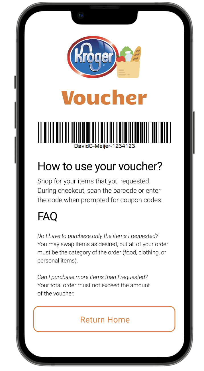
How it would work:

We will start as a mobile app.
Most suitable platform to support the quick, frequent donations we wanted to facilitate.

The form of aid will be store-vouchers.
Vouchers will work for the store and product category listed on a requestor’s wish list.

There is a $200/month request limit for each user.
Our solution is only designed to be a supplementary form of aid, to help afford livelihood necessities.

To balance trust with privacy, most information will be optional.
Requestors just need to specify store name, product category, and approximate list of items to help donors have a general idea about where their money would go.

For privacy and flexibility, requestors aren’t restricted to the exact wishlist they post.
Recipients can redeem any items with their voucher as long as the store and product category remain the same.

Users will be soft-verified in order to join the app as a requestor.
If the reported income is less than the livable income in their area, the user qualifies for need-based donations through Humankind.
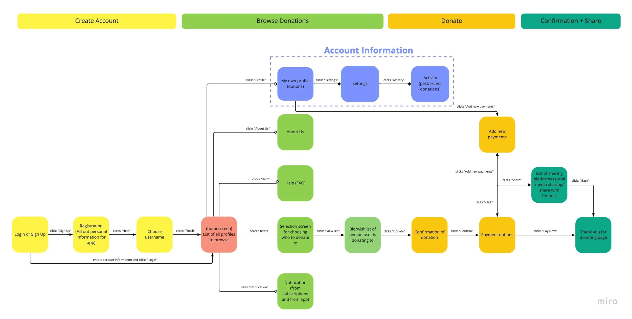
User Flow
Donor Tasks
1. The user creates an account to browse donation requests.
2. When they find an individual they want to help, they make a donation and then receive a donation confirmation.
0 4 | P R O T O T Y P E & T E S T I N G
Prototypes & Testing
We conducted 20 usability tests across 3 rounds.
We created paper, mid-fidelity, and high-fidelity prototypes to do concept and feature testing.

0 5 | I T E R A T I O N
Key Design Changes
Here are four major design changes we made based on feedback from our tests.
Key Change #1
Changed the home screen to emphasize requests, instead of requestors.
When people’s photos were too big, the interface looked like a dating app.

Original
Final
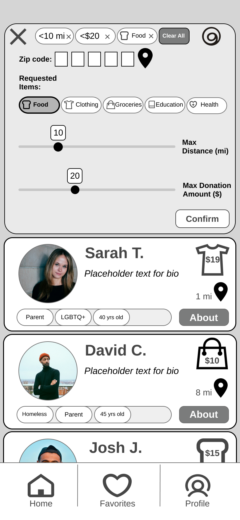
Key Change #2
Removed ability to filter requestors by identity tags.
Request item category was the people’s first filter of choice. Identity tags might introduce unnecessary bias too early.
Original

Final
Key Change #3
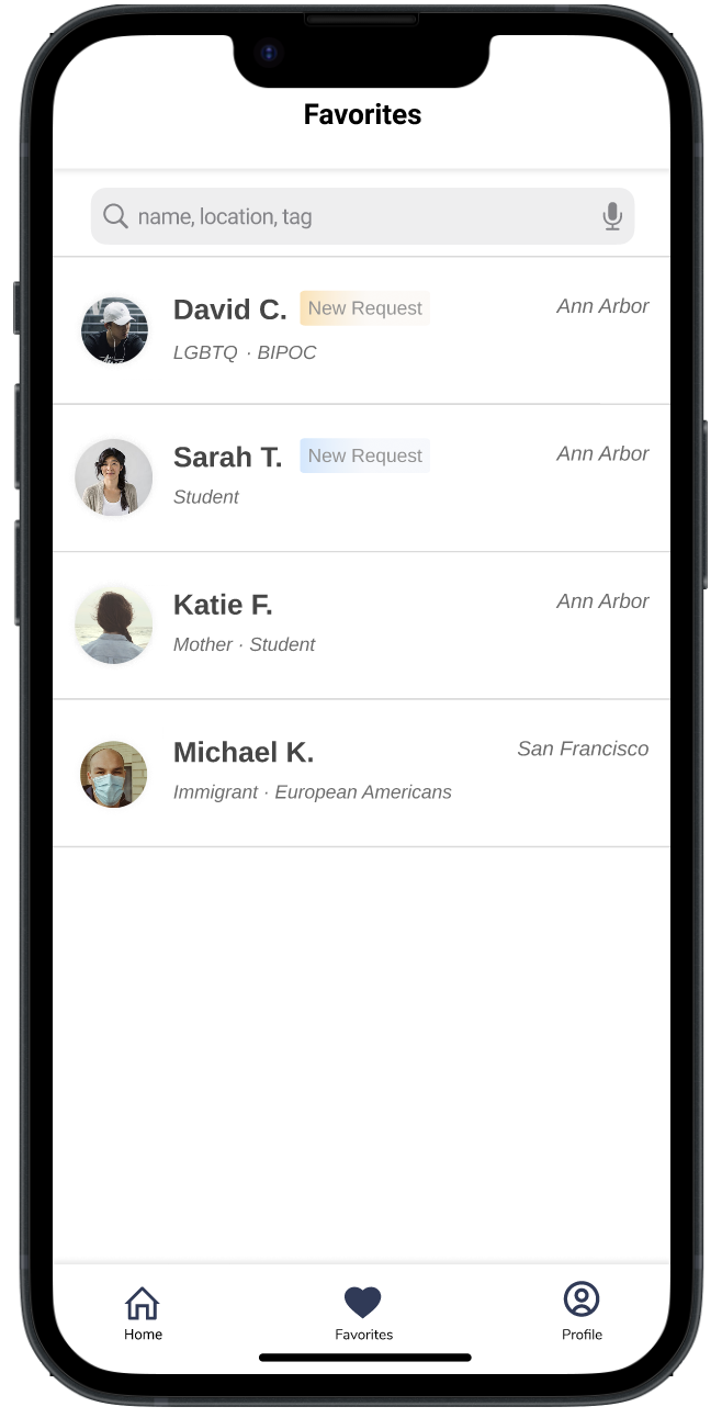
Removed messaging but added a favorites feature.
We wanted to facilitate an interpersonal aspect across time but wanted to limit risk of harassment.

Original
Final
Key Change #4
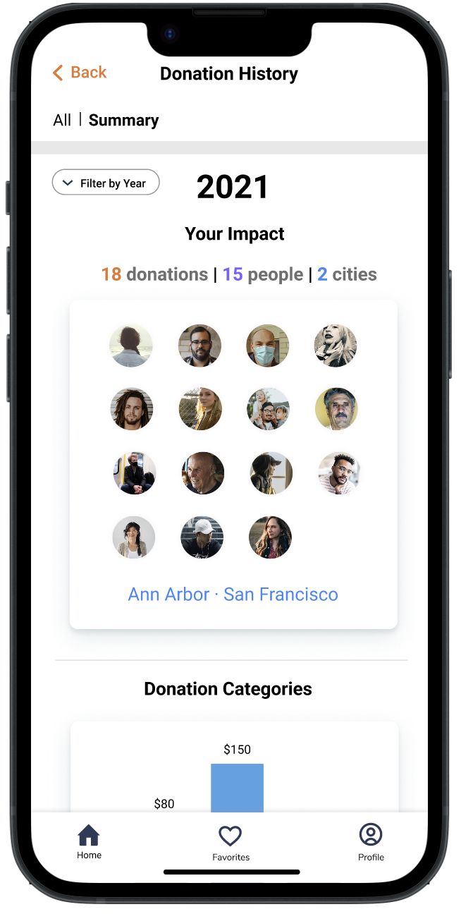
Changed donation history to emphasize people they helped instead of spending.
People cared less about how much money they spent and more about what impact they had.

Original
Final
F I N A L D E S I G N
HumanKind
A donation platform that facilitates quick voucher-based donations between community members.
Key Features
1. Find Wishlists
On their homescreen, donors can find wishlists from requestors in their area using filters.
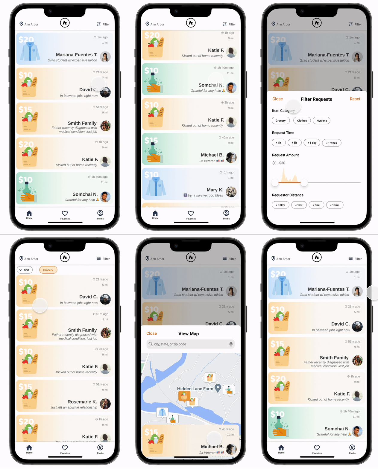
2. Browse & Donate
View wishlists and the requestor’s story and history.
Donate to fulfill wishlists.

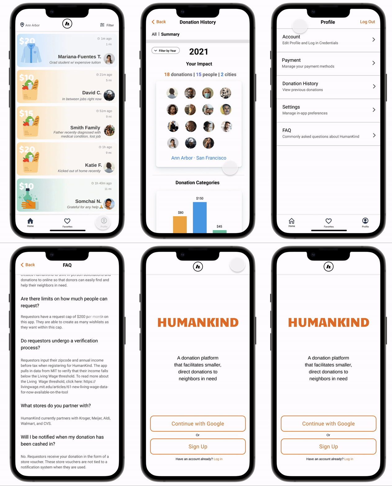
3. View your Impact
See itemized donations and your impact summary by year in the Donation History page.
4. Create wishlists as a Requestor
Despite less user research, we still prototyped the requestor side to envision the entire solution flow.

Reflection
Next Steps
1. Conduct more recipient side research & testing. Conduct more needs assessment for requestors. It was difficult to get access to these users due to privacy and ethical issues.
2. Refine In-app language. Since finances are a sensitive topic, do more research to make sure that our in-app language is sensitive, appropriate, and empathetic.
3. Ensure Accessibility. Conduct an accessibility audit and take into account common disabilities such as mobility and visual impairments.
4. Expand to omni-channel experience
Learnings.
1. Get prototypes in front of users sooner rather than later. We learned just as much from our paper prototype testing as we did from our hi-fidelity testing. It’s important to validate or eliminate assumptions as soon as possible.
2. Add value wherever you can even if you can’t serve everyone. It’d be great to help every single vulnerable population. However, we realized that if we do so, we wouldn’t be able to adequately meet all of their nuanced needs. So even though our solution can’t help with those who have greater financial needs, we still believe adding incremental value is important.
Open Questions.
1. Store Cooperation
2. Location Based Nuances
3. Technology Constraints
4. Building trust vs Protecting Privacy


