Discovery+ Trailer Rail
We designed a Coming Soon rail that displays trailers for upcoming shows on the Discovery+ platform.
Company: Discover+
Project Duration: 2 weeks
Team: 2 UX Designers, 1 Product Manager
My Role: UX Designer
P R O J E C T O V E R V I E W
Problem
How might we help viewers discover, preview, and return to watch upcoming D+ content?
Outcome
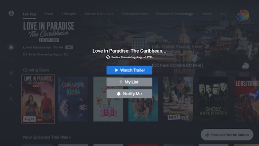
We designed a “Coming Soon” rail that displays trailers for upcoming content. Viewers can add shows to their list to get notified when a show premieres.
S O L U T I O N P R E V I E W
Discovery+ Trailer Rail
View Trailers. Save upcoming shows. Get notified when a show premieres.
On their “For You” page, viewers can watch trailers and learn more about upcoming shows.
For upcoming shows they’re interested in, viewers can add them to their list and get notified when the shows premieres.

D E S I G N P R O C E S S
Define
Users & User Tasks
Design Criteria
Success Criteria
Discover
Stakeholder Interviews
Comparative Analysis
Heuristic Analysis
Deliver
3 Hi-fidelity Prototypes
Final Recommendations
0 1 | D I S C O V E R
Our viewers had a problem.
There was no way for D+ viewers to find and preview upcoming shows.
“We have watched all the shows we care about on Foodnetwork and HGTV. Just would like a way to easily find new shows.”
— Customer Review, April 2021
“Make an option where you can preview a show before you watch a series to see if you would enjoy it or not.”
— Customer Review, October 2021
We had trailers for upcoming shows but they weren’t very visible or accessible.
1. Not Visible. There was no way for people to browse through all the upcoming shows at once. Teasers for upcoming shows would be mixed in with current shows.
2. Not Accessible. Viewers had to manually search for an upcoming show and navigate to its show page to view the trailer.

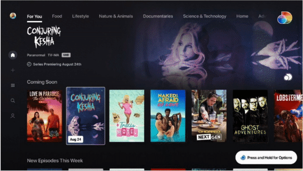
Current Experience: Viewers can only view this “Conjuring Kesha” trailer if they 1) manually search for the show and 2) navigate to its show page.
Comparative Analysis
When it came to promoting upcoming shows, we lacked standard features found on our competitor platforms.
These gaps helped shape our design priorities.
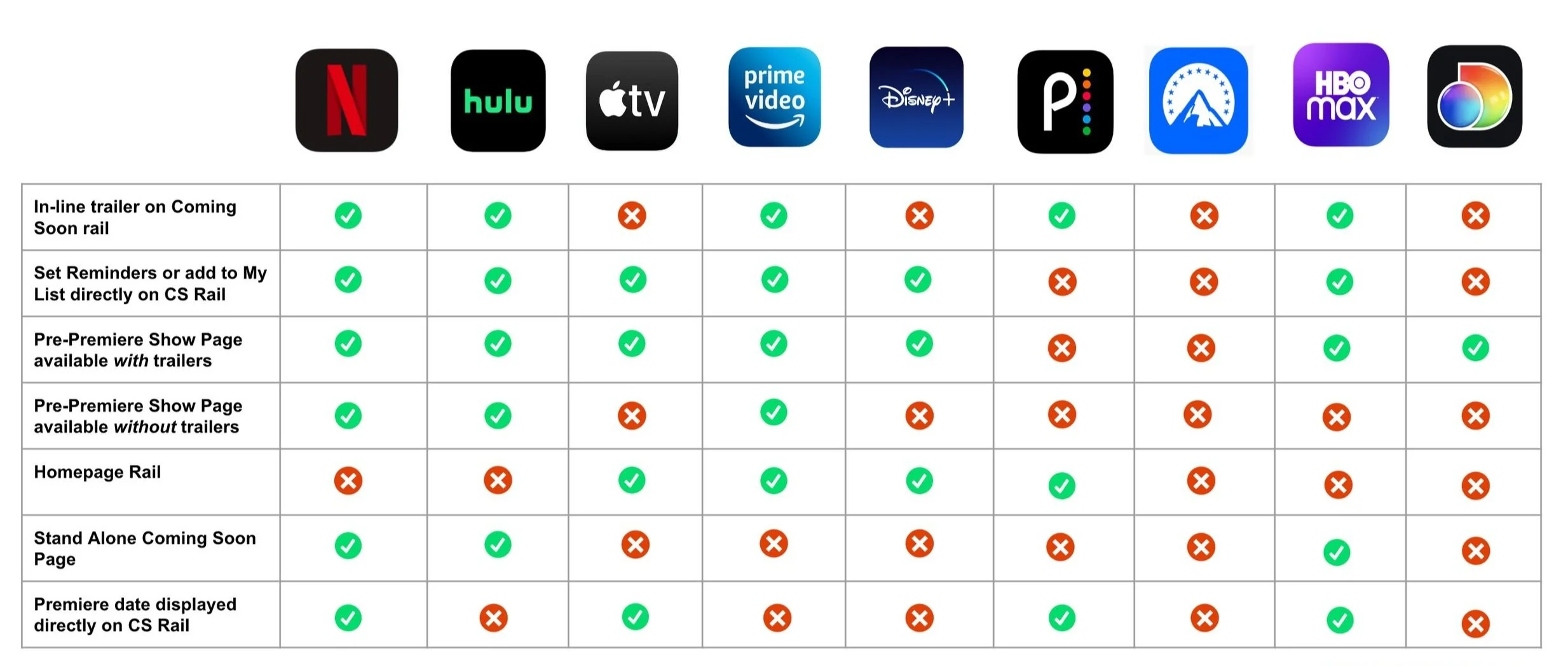
If we designed a way for viewers to consistently find and look forward to upcoming shows on our platform, we could increase retention, engagement, and positive ratings!
D E S I G N C H A L L E N G E
How might we help viewers discover , preview, and return to watch upcoming D+ content?
0 2 | D E F I N E
Users & Tasks
Target Users
Proactive and engaged. Customers who are actively searching for refreshing new content on the platform.

Anticipatory. Customers who like to plan ahead on what they will watch next.

Critical and curious. Customers who watch trailers to gauge interest before beginning the episode of a show.

User Goals
Design Challenges
“I want to easily watch trailers for upcoming content so I can anticipate new offerings.”
“If I like a trailer, I want to add the show to My List and get notified when it premieres.”
User Tasks
Users need to complete the following:
View trailer
Add Show to my list
Turn on Premiere Notification
Bring awareness to new features
Since these users tasks are new, how do we make viewers aware of them?
Minimize real estate
Displaying permanent CTAs takes up prime real estate and would not be scalable for smaller devices.
Simplify interactions
# of interactions for user tasks should be minimized because remote controls are unwieldy.
To solve these design challenges, we decided to utilize a tooltip and overlay menu to help users complete their tasks.

01 | Tool tip with “Press and Hold for options” appears in bottom upon initial focus, directing users to click on their remote.
User tasks
View trailer
Add Show to my list
Turn on Premiere Notification
02 | After clicking on the button on their remote, the user sees an overlay menu with options such as “Add to My List” and “Notify Me.”
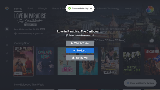
03 | A toast appears at the top to provide confirmation once users complete an action.
Complete Interaction Flow

04 | Users will see the same action options if they bypass the tooltip and click directly into a specific show page, like the one above.

0 2 | D E F I N E
Design Criteria & Success Metrics
Design Priorities
What do we prioritize for the initial MVP?
1. Design for TV first
TV is the hardest to design for compared to other streaming devices. It would be easier to scale our TV design down for mobile, tablet, and desktop in the future instead of vice versa.
2. Trailers should be in-line
Instead of being punted to a separate screen, viewers should be able to watch trailers directly on the “For You” page, where the trailer rail is located.
4. Room for Closed Captioning
Trailer design must have enough room to accommodate subtitle displays.
3. Display Key Metadata
Along with the show title and show art, we also want to display a premiere date and the brodcasting network’s logo.
5. Preserve Integrated Experience
Our design should naturally integrate into the existing D+ experience, where most content is housed in horizontal rails.
Success Metrics
How will we assess the efficacy of this feature post-implementation?
% of users who play a trailer on the Coming Soon Rail out of the total number who encounter the rail


Number of users who add the show to “My List” and opt-in to Notifications after viewing a trailer
Increased engagement with content as more trailers are released on the platform

Positive qualitative feedback from viewers

0 3 | D E L I V E R
Hi-fidelity Prototypes

“Coming Soon” Trailer Rail Designs
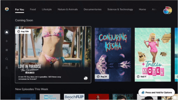
Design 1: Trailer in Hero with Small Cards
Overview
Trailer: Begins playing in top right hero after user focuses on a show card for 3 seconds.
Show cards: Standard small size. Premiere date appears upon focus.
Metadata: Displayed in top hero next to trailer upon focus.
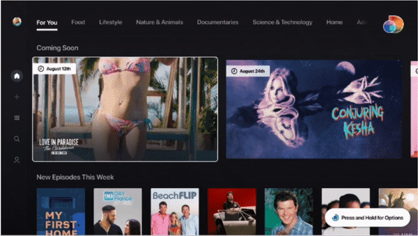
Design 3: Wide 16 x 9 Trailer Cards
Design 2: Expanding Trailer Cards
Overview
Trailer: Begins playing after card has expanded.
Show cards: Cards grow and shrink simultaneously to reduce nausea.
Metadata: Premiere date is permanently displayed. The rest show up when a tile expands.
Cons
Metadata is housed separately from the content cards
Premiere date badge only appears upon hover. Users may forget premiere dates as they browse.
The Trailer Rail lacks immediate differentiation from D+’s current content rails
Pros
Smaller, vertical cards in the rail display greatest amount of content simultaneously
Trailer playing in the large hero is visible and matches the current D+ experience the best
We ultimately recommended Design #3 to the Product Team!
it had the best balance of usability and aesthetics out of our three final designs.
Overview
Trailer: Begins playing inside of the show cards after user focuses.
Show cards: Large 16 x 9 Cards
Metadata: Premiere date is permanently displayed. The rest show up when a trailer plays.
Pros
Expandable cards save on static real estate without impeding the trailer viewing experience
The way the cards perform and reveal more metadata simulates a theater watching experience
Cons
Dwell interaction may be annoying and distracting to some users
This Interaction is very different from how the rest of the D+ platforms’s cards work
Pros
Eye-catching and different from other rails on the page, which may increase engagement
In-card trailer play aligns with competitor interactions
May match user’s mental model the most
Cons
Static cards take up a lot of real estate without presenting much information
Large cards may feel annoying and clunky to browse through for users who want to browse quickly
H A N D O F F
Next Steps
We got positive feedback on our designs, but there are still open questions as we move into testing.
Research
Trailer experiences for customers (UX/R)
How customers are interacting with trailer rail on other platforms (UX/R)
Analyze HBO Max Coming Soon Page & discuss with PMs who have worked on it
Testing
UI/Design Refinements
Rail Position
Usability Testing
Open Questions
Accessibility
Engineering Capabilities
Personalization of Coming Soon content
More Projects
Humankind

Ferndalemi.gov

National Vehicle Condition
