
Ferndale Website Redesign
A reorganization of Ferndale’s city website to helps its citizens find integral resources more efficiently.
Client: City of Ferndale, MI
Project Duration: 4 months
Team: 4 UX Designers/Researchers
My Role: UX Designer & Researcher
P R O J E C T O V E R V I E W
Problem
How might we help the citizens of Ferndale find the resources they need on Ferndalemi.gov?
Outcome
We reorganized the information architecture and navigation of the site to reflect the mental models of its users.
I N T R O D U C T I O N
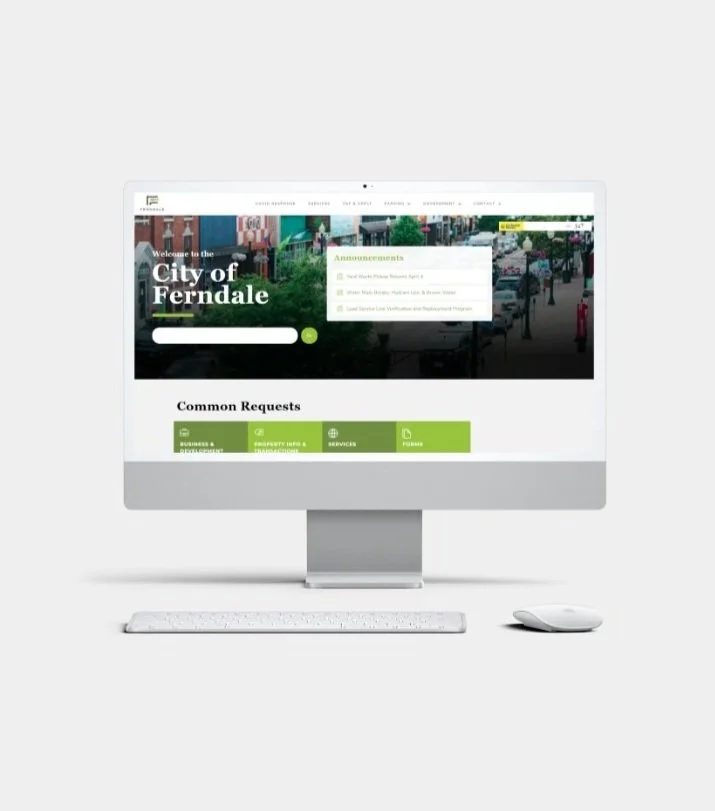
Ferndalemi.gov is the city website for Ferndale, MI.
Maintained by the city government, the site houses public resources and information for the city’s businesses and 13,000 citizens.
The site is used by many groups.


Businesses
Residents
Visitors
City Staff

But Ferndale city staff approached us with some requests for the site.
1. Make it more usable.
Citizens can’t find what they’re looking for on the site.
2. Make it more sustainable to maintain.
As a result, the city staff spends a lot of time personally helping citizens find resources and maintaining disparate communication channels outside of the site.
3. Make it scalable.
The city wants to expand their website to include more visitor and business resources, while still maintaining a good user experience for current residents.
H OW M I G H T W E . . .
How might we redesign Ferndalemi.gov to be more usable, more sustainable to maintain, and more scalable?
Design Process
Problem Exploration
User Interviews
Stakeholder Interviews
Solution Exploration
Heuristic Analysis
Comparative Analysis
Web Analytics
Card Sorting
Deliver
Mid-fidelity Prototype
Site Map w/ new information architecture
0 1 | P R O B L E M E X P L O R A T I O N
To improve site usability, we started by interviewing Ferndale citizens.
1. What tasks do people currently use Ferndalemi.gov for?
2. What information do residents expect to find on the site?
3. What are people’s difficulties when it comes to finding what they need on the site?
The Key Issues we found
Issue #1
Misclicks
The site’s navigation labels and information architecture don’t match users’ mental models, leading to inefficiencies and misclicks.

Issue #2
Difficult to Redirect
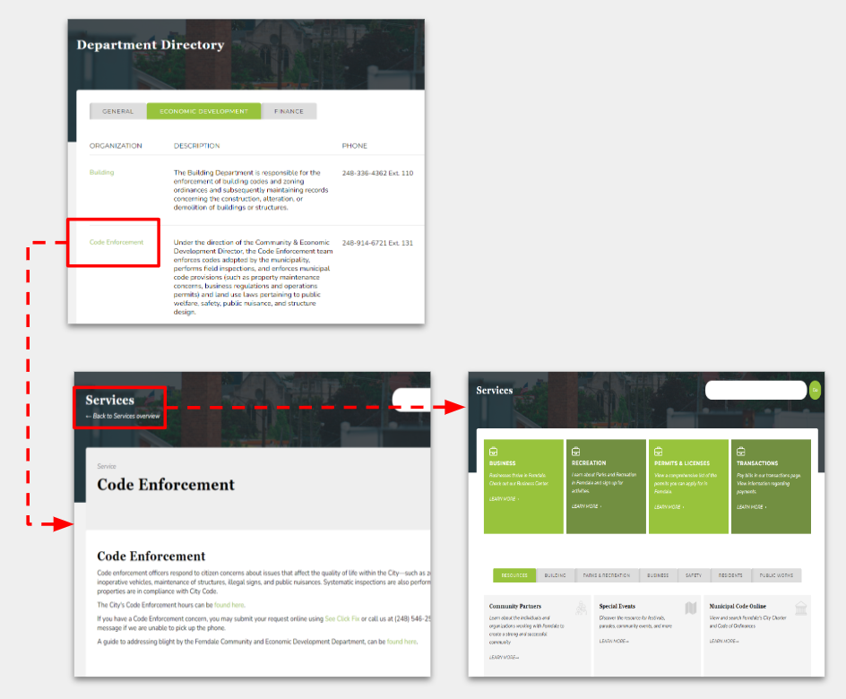
Lack of standardized navigation & breadcrumbs. Users can’t easily redirect themselves if they are in the wrong place.
Issue #3
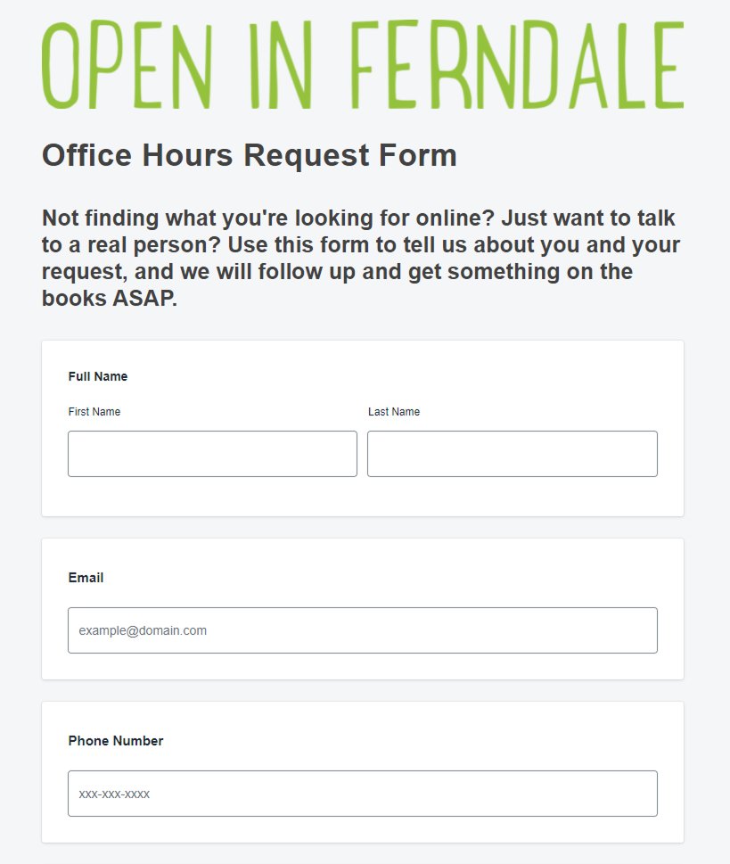
Outdated content
Users often encounter dead links or outdated content. Staff don’t have organization or capacity to maintain the site.
Example Image:
“Register for Water Service” is housed underneath “Pay and Apply,” instead of “Services.”
Example Image:
Users encounter live links that lead to closed questionnaires.
Example Image:
Users must rely on the browser’s back button to return to a previous page, because embedded navigation will redirect them to the wrong place.
0 1 | P R O B L E M E X P L O R A T I O N
To improve sustainability and scalability, we then talked to teams who were responsible for the site’s development and maintenance.
We learned more about the reality of the site’s upkeep and clarified the design constraints we would be working with.
Armed with a better understanding of key usability issues and maintanence constraints, we began to redesign Ferndalemi.gov to fit the city staff’s and the residents’ needs!
No Site Maintenance Plan
New pages are added on adhoc basis by multiple departments. Once added, pages are not reviewed. No internal site map to reference.
Bloated Parent Site
City charter states that, even if unrelated, all Ferndale webpages and microsites must flow up to the same parent.
Restrictive Developer Contract
Limited layout options. All proposed changes must be emailed to 3rd party developer for implementation and cannot differ too much from current site aesthetic.
0 2 | S O L U T I O N E X P L O R A T I O N
1. An initial heuristic analysis confirmed navigation issues.
Business, government, residential, and circumstantial (e.g. COVID) resources are mixed in together.
Navigation menus types are varied and inconsistent across pages.
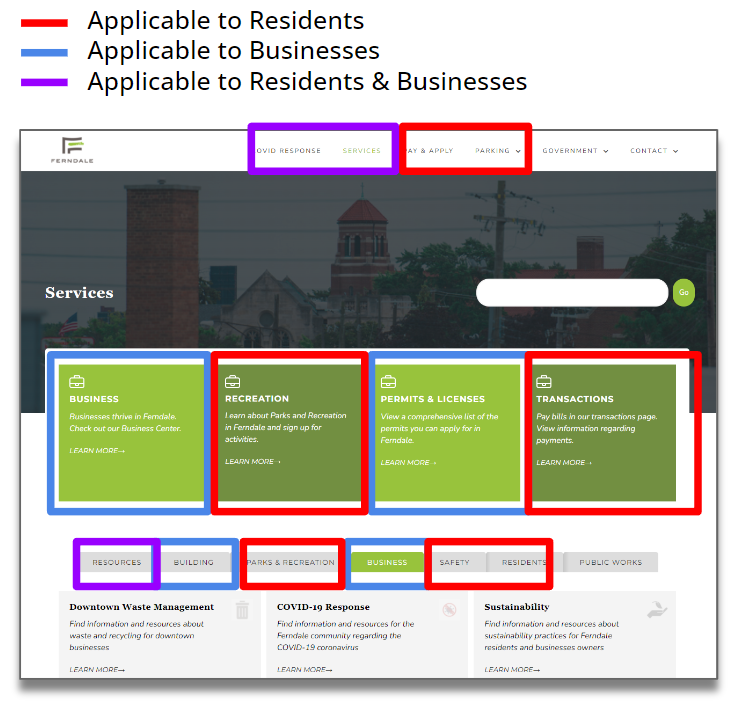
Ferndalemi.gov Homepage - Varied Content Types
2. To solve navigation issues, we realized the best way to split content on the site is by user type.
This framework lets people with multiple user identities self-select based on their current need.
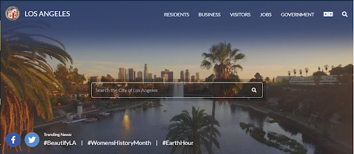
Comparative Analysis with LA City Website - which splits navigation by user types.
3. Within user types, we then did card sorting to understand people’s mental models.
This helped us recategorize and reorganize all the content on the site.

Participants grouped, labeled, and arranged all the navigation labels and page headers on the site.
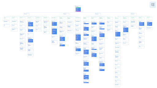
4. And finally, we organized the Information Architecture based on our findings.
We restructured all the content in the site to fall into 4 categories in the global navigation:
Community
Resident Resources & Information
Business Resources & Information
Government

S O L U T I O N S
We built a mid-fidelity prototype of the redesigned site, reorganized to reflect how Ferndale residents naturally search for information.
S O L U T I O N S
Before: Navigation
Previously, confusing navigation labels and information architecture made it hard for users to find the content they needed or redirect themselves when they misclicked.
Inconsistent Menu Structures: Variation across menus forces users to rely on memory rather than visual recognition.
Missing Navigational Cues: Lack of location indicators makes it difficult for users to know where they are on the site.
Unclear Global Navigation: Fails to distinguish between user groups like residential, business, government, and visitors.
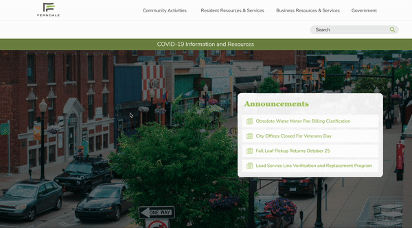
S O L U T I O N S
After: Navigation
The new navigation reflects how residents naturally search and access information on the website.
User-Specific Global Navigation: Separates users by type, ensuring they only see pages relevant to their needs despite the site's size.
Intuitive Content Labels: Aligns with users’ mental models to reduce misclicks and improve engagement efficiency.
Contextual Navigation Aids: Side menus and breadcrumbs support user orientation and site navigation.
Consistent Visual Design: Maintains visual uniformity across pages to help users quickly get their bearings.

S O L U T I O N S
Before: Information Architecture
Without an internal site map or a maintenance framework, the site had become bloated and outdated.
Lack of Content Management Framework: Absence of a structured system led to outdated content and a deteriorating user experience as the site expanded.
Missing Site Map: Without a site map, city staff lacked visibility into existing pages and how they should be organized.
S O L U T I O N S
After: Information Architecture
To help staff maintain and scale the site, we created a site map reflects the newly organized information architecture.
Visual Hierarchy & Interaction Flow: Establishes a clear content structure and simulates the layers and clicks involved in site navigation.
Client-Friendly Platform: Hosted on Octopus.do for its ease of use and no-cost editing capabilities for the client.
Content Inventory & Organization: Enables the client to assess existing content and plan systematic updates for improved site structure.
Take a closer look here.
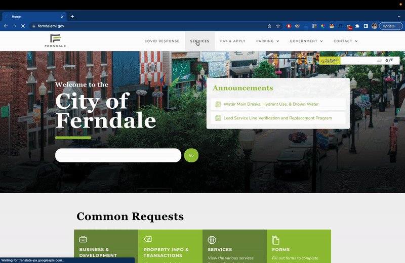
Final Prototype
We integrated all of our changes into a mid-fidelity prototype we gave to city staff.
The prototype would be sufficient to use for user testing and to serve as a blueprint for their developers.
Take a click through!
Lots of positive feedback from Ferndale residents and city staff!
We presented our prototype to users at Ferndale’s Citizen’s Interaction Design Fair, shown in the picture.
Residents and staff who came up to our laptop to click through and test out the new navigation expressed excitement for the future of their city website!

Next Steps
If I had more time
Conduct more interviews and card sorting sessions with businesses
Conduct usability testing on our prototype before implementation using the sample testing protocol we created here
Conduct an accessibility review for the current site
More Projects

National Vehicle Condition
D+ Trailer Rail

Humankind
