
National® Vehicle Condition Report
Created an interactive digital report that documents a rental car’s pre-existing damages in a way that is clear, accessible, and intuitive.

Company: National Car Rental
Project Duration: 4 months
Team: 3 UX Designers, 1 Product Manager
My Role: UX Designer
P R O J E C T O V E R V I E W
Problem
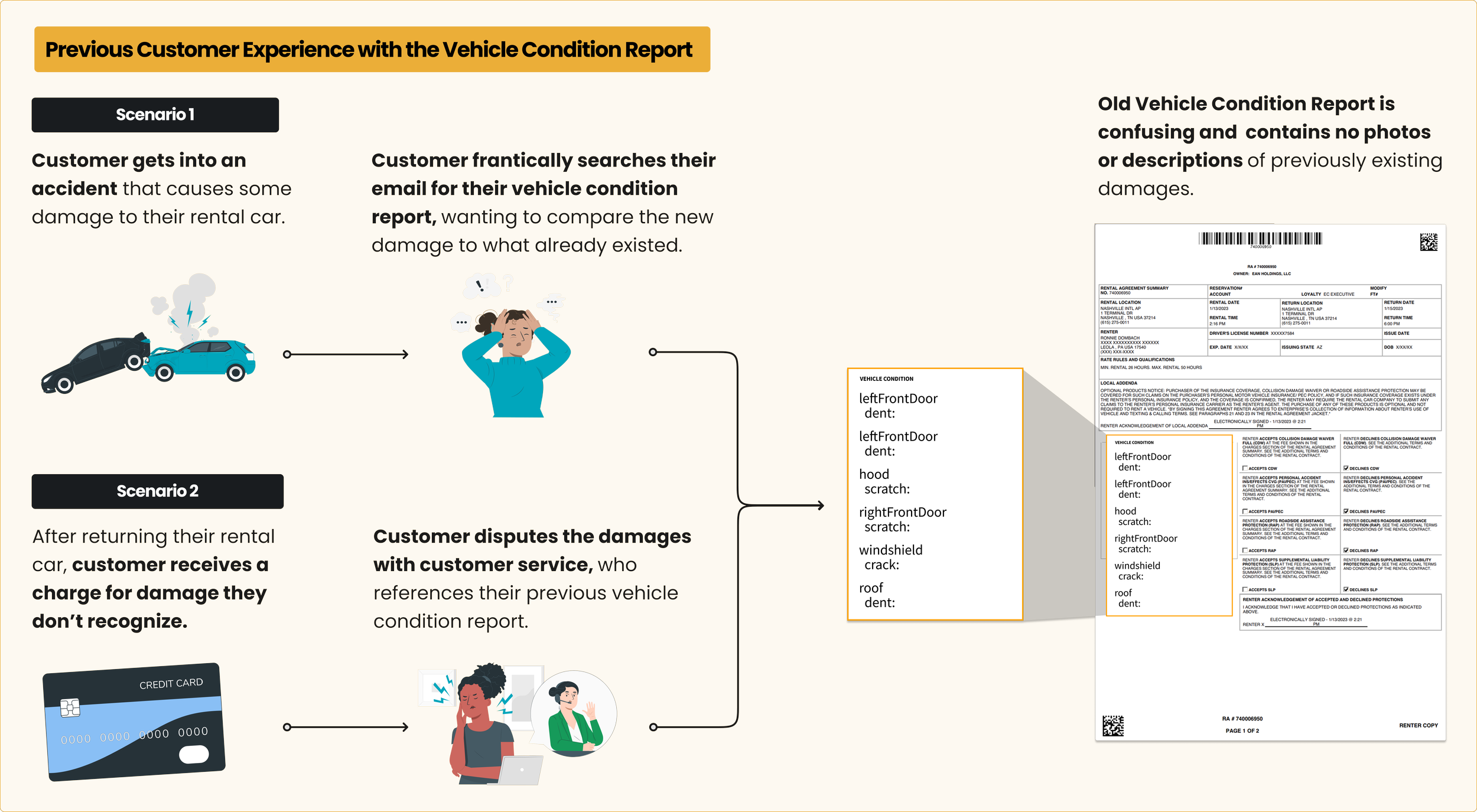
How can we prevent disputes between customers and National® over what damages on a rental car are new vs pre-existing?
Outcome
Designed an interactive vehicle condition report for customers that serves as a single source of truth, accurately documenting a car’s pre-existing condition before it’s rented out.
S O L U T I O N P R E V I E W
An Interactive Vehicle Condition Report
A single and comprehensive source of truth that clearly documents a rental car’s pre-existing damages.
Documentation of car’s pre-rental condition
Clear photos
Details about damages
User education on the differences between damage vs. wear and tear
D E S I G N P R O C E S S
Double Diamond Method
Discover
Understand problem and product context
Define
User Goals
Design Goals
Constraints
Develop
Research and Testing
Iterative Designs
Customer Journey
Deliver
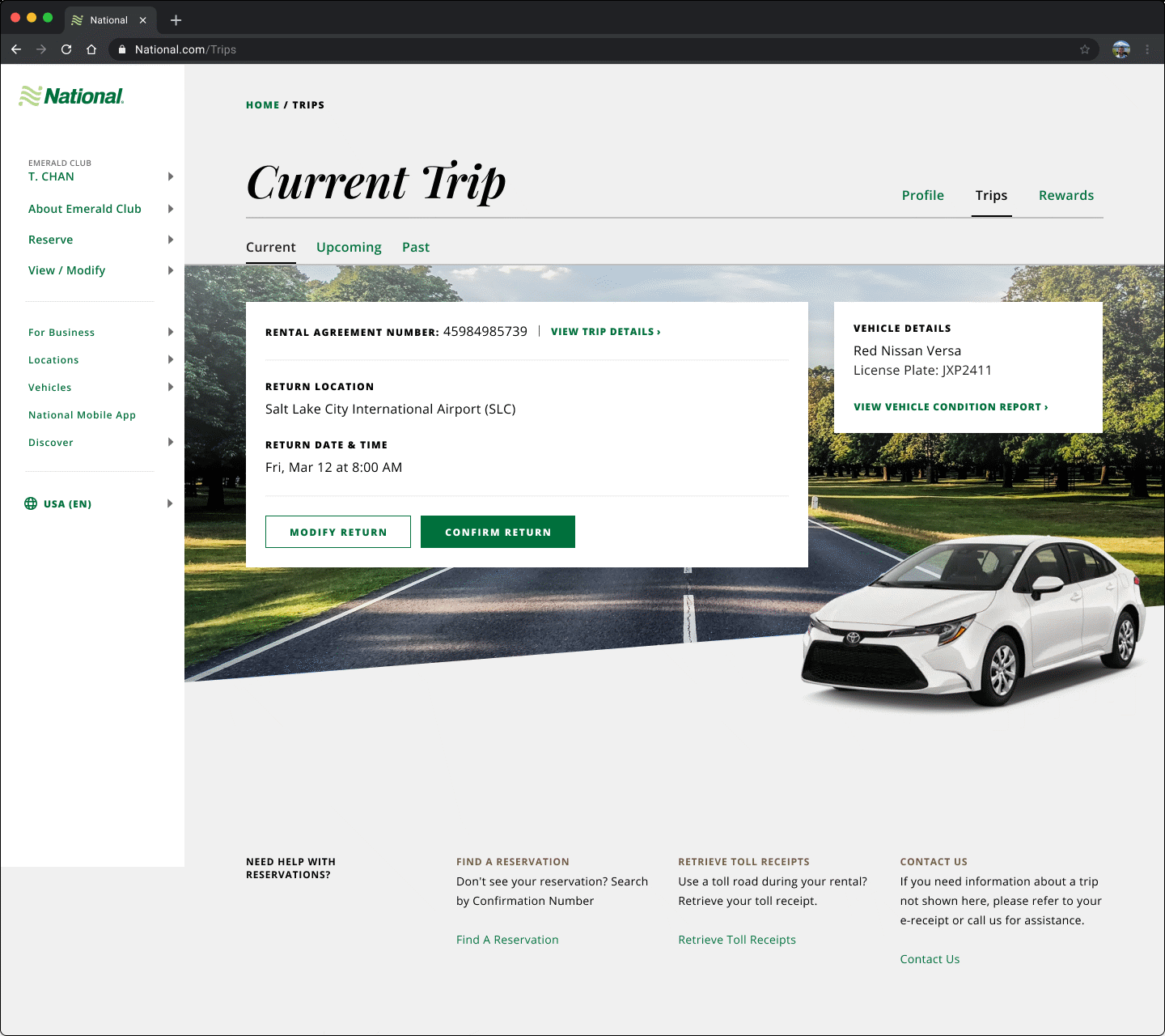
Vehicle Condition Report
Damage vs. WT Webpage
Rental Trip Dashboard
Past Trip Receipts
Rental Agreement Email
P R O B L E M C O N T E X T
Problem
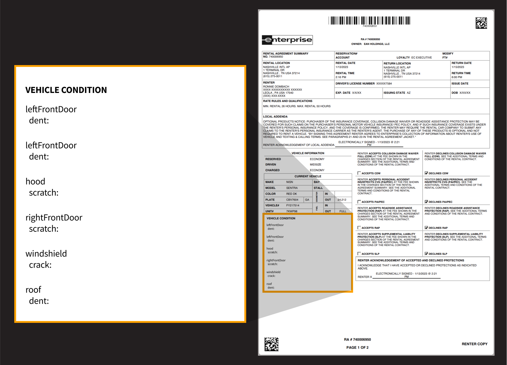
National Car Rental® did not have a comprehensive process for documenting the pre-existing damages on a vehicle before renting it out.
As a result, customers frequently made complaints disputing charges of pre-existing damage on their cars.
647
# of complaints National® received in 6 months from customers disputing what damages were new vs existing.
P R O J E C T
Design an interactive vehicle condition report for customers that serves as a single source of truth, accurately documenting a car’s pre-existing condition before it’s rented out.
D E F I N I N G S U C C E S S
User Goals

1. Know where to find and how to read my vehicle condition information.

2. Trust the condition information shown is accurate.

3. Know the difference between damage (that I could be charged for) vs. normal wear and tear (that I won’t be charged for).
D E F I N I N G S U C C E S S
Design Tasks
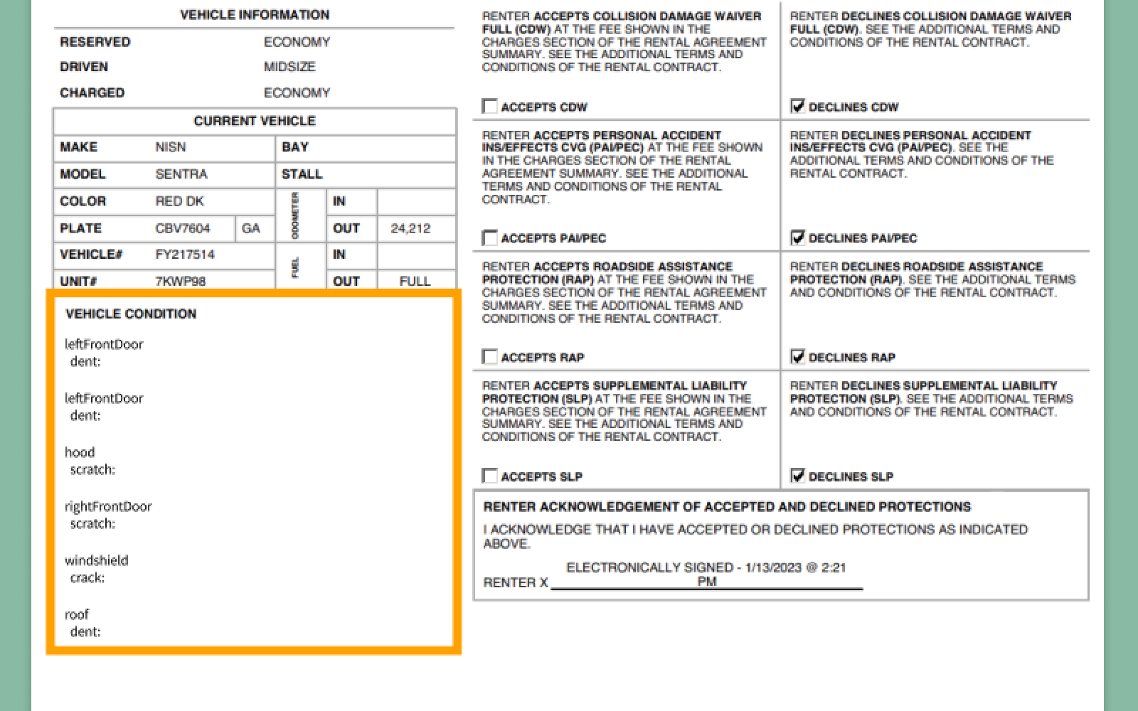
1. Redesign the existing vehicle condition report (PDF) into an interactive digital report.
2. Educate customers about what counts as new damage they would be charged for, compared to wear and tear they won’t be charged for.

3. Maximize accessibility and visibility of the report to increase customer awareness and engagement.

D E S I G N T A S K # 1
1. Redesign the existing vehicle condition report (PDF) into an interactive digital report.
Goals:
Make the report easy to understand and digest.
Leverages photos and details about damages to maximize customer clarity.
Goal 1: Make the report easy to understand and digest.
Design Decision #1
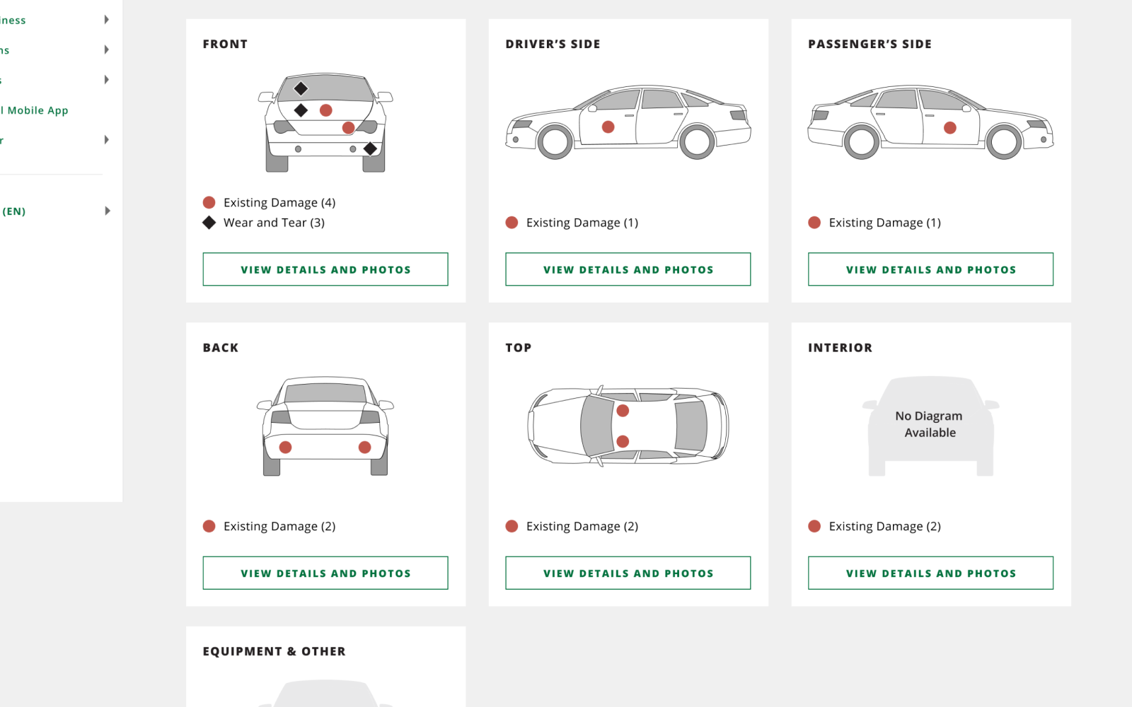
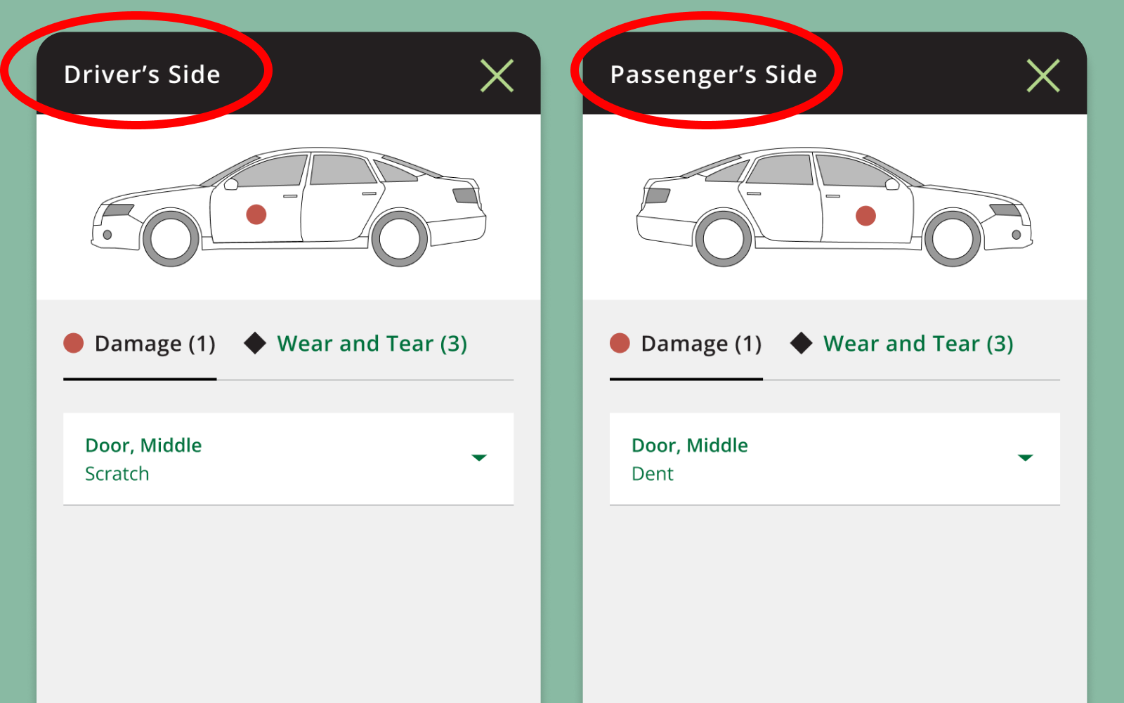
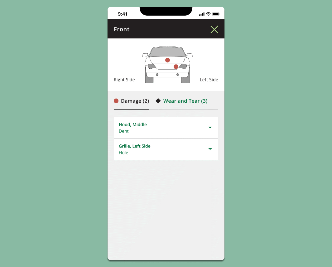
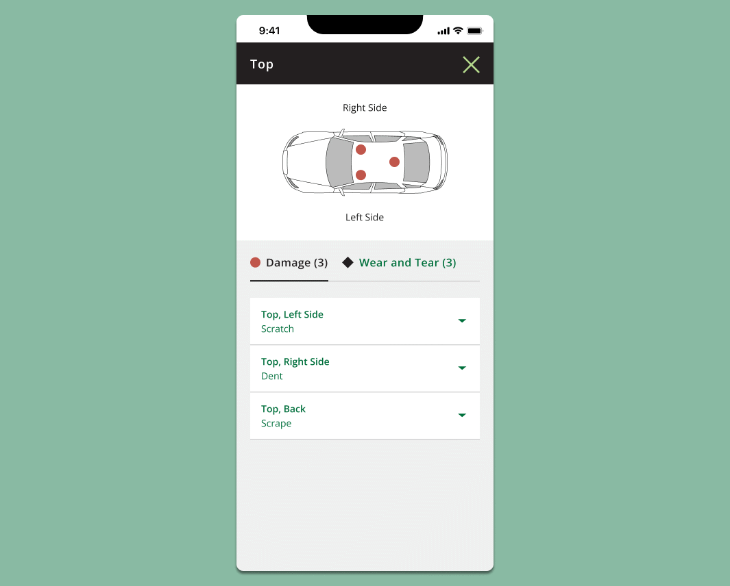
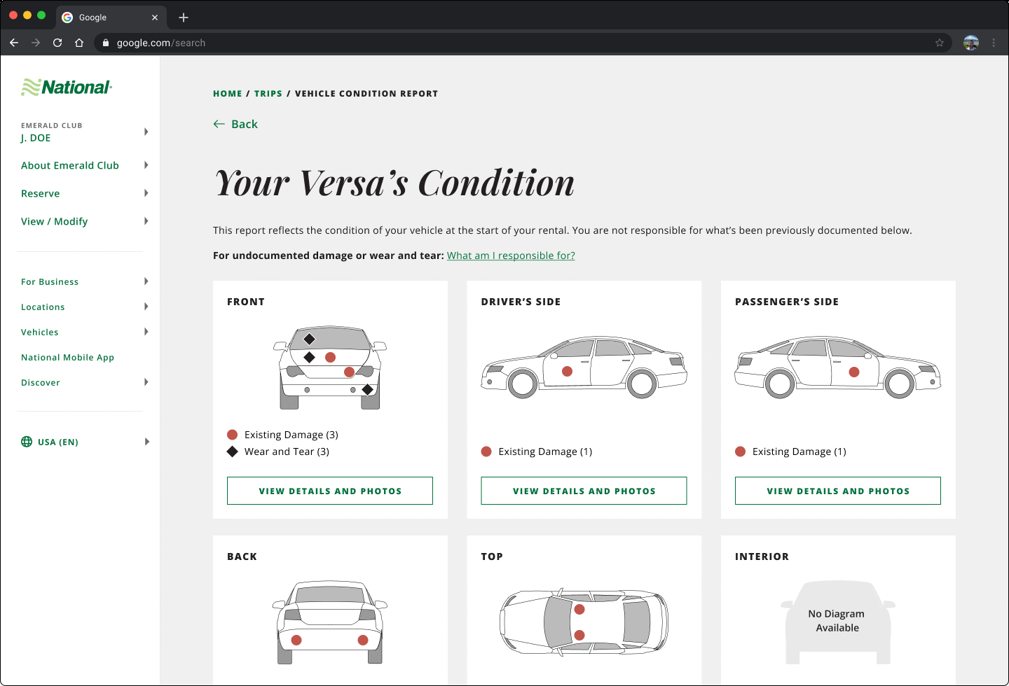
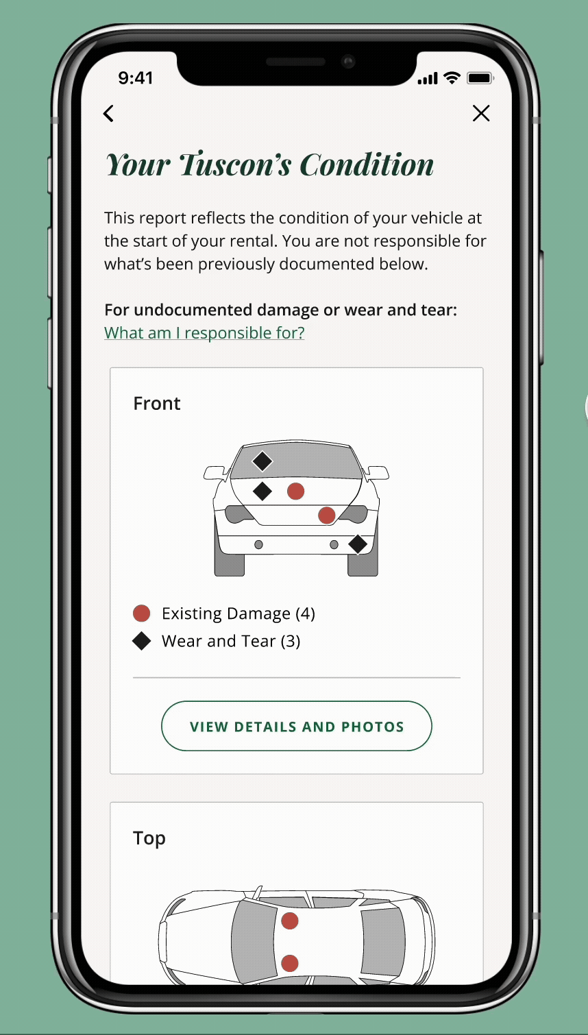
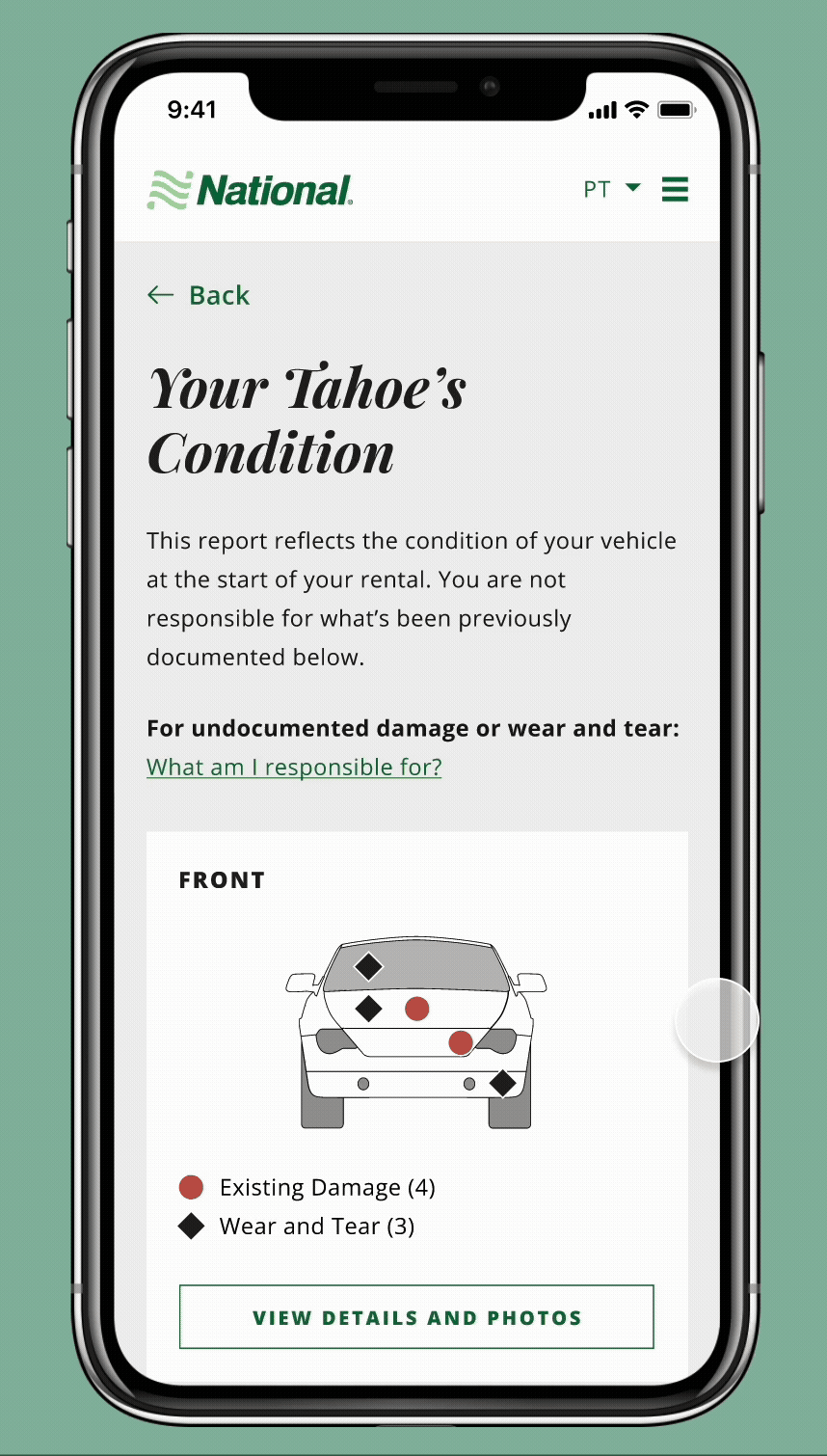
Split the car Into 7 sides
We designed a landing page that displayed the car schematic divided into its seven different sides.
This gave customers a structured, visual way to navigate damages rather than feeling overwhelmed by a single long list.
Design Decision #2
Separate sides of the car with issues from sides without
To build trust and clarity, we differentiated between car sides with issues and those without.
Issues section: Sides with damages were clearly flagged for further review.
No issues section: Sides without damages were also shown so that customers could see that all sides of the car were inspected and accounted for

Design Decision #3
Differentiate between damage vs. wear and tear
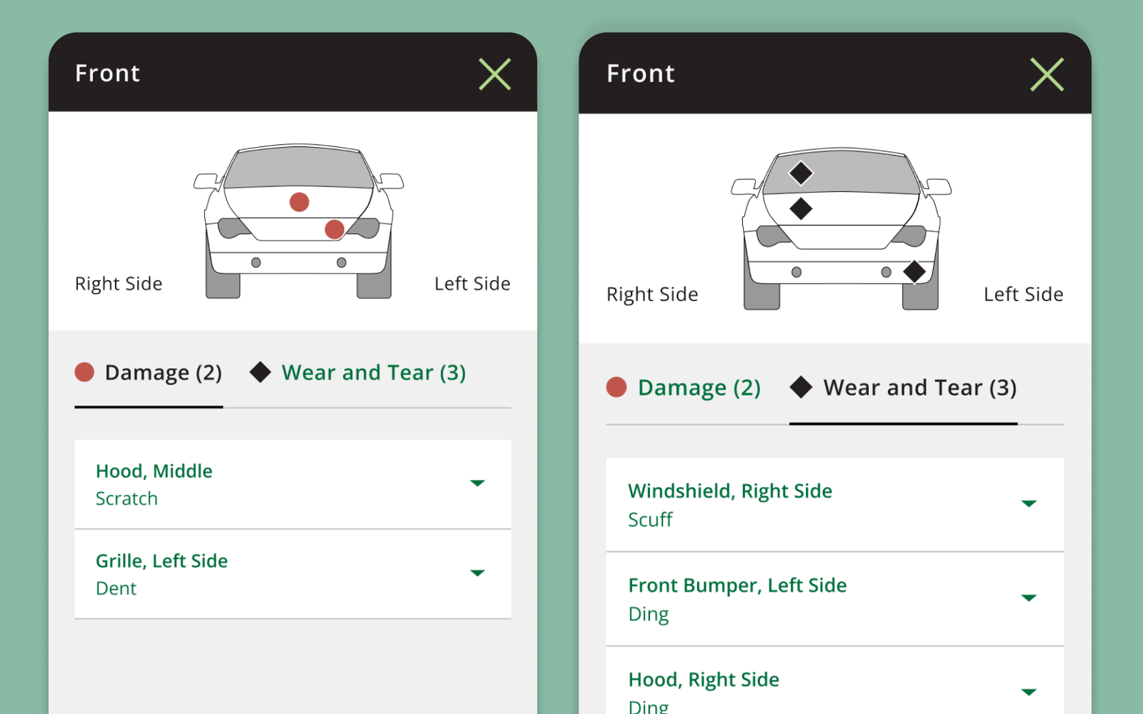
When customers clicked into a car side for more details, they saw a tabbed list that separated:
Damages
Wear and Tear
This approach reduced visual clutter. It also reinforced that damage (harm of a certain size) is different from wear and tear (small, expected use over time).
Design Decision #4
Use context-friendly language
We used language that prioritized clarity.
“Driver’s side” and “Passenger’s side” were used to help orient customers instead of ambiguous terms like “left” or “right.”
Goal 2: Leverage photos and details about damages to maximize customer clarity.
Design Decision #1:
Link photos with light-up indicators to help pinpoint damages
When a customer clicks into a damage listed, they see both:
A photo of the damage
The corresponding indicator lighting up on the car schematic
This visual link makes it easy for customers to match photos with indicators and understand where to look for damages on their physical car.
Design Decision #2
Enhance photo viewing experience
To improve usability, we included:
Zoom functionality so customers can examine details closely.
The carousel format for reviewing photos, allowing customers to browse damages without having to open each item individually.
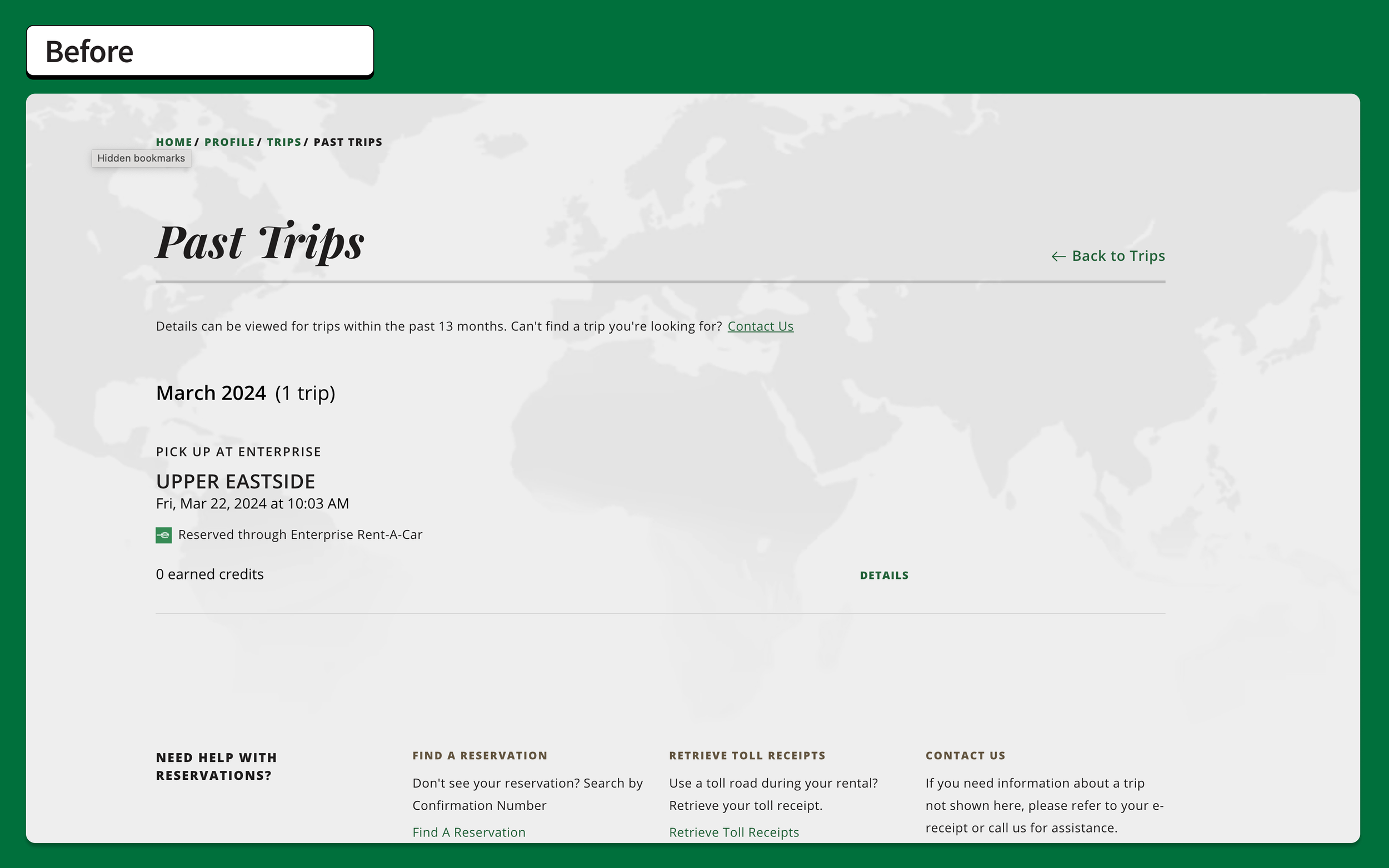
Final Product: Before vs. After
Redesigned the existing vehicle condition report (PDF) into an interactive digital report.
Vehicle Condition Report: Before (PDF only)
App: After

Mobile Web: After

Desktop: After
D E S I G N T A S K # 2
2. Educate customers on the difference between damage and wear and tear.
Goals:
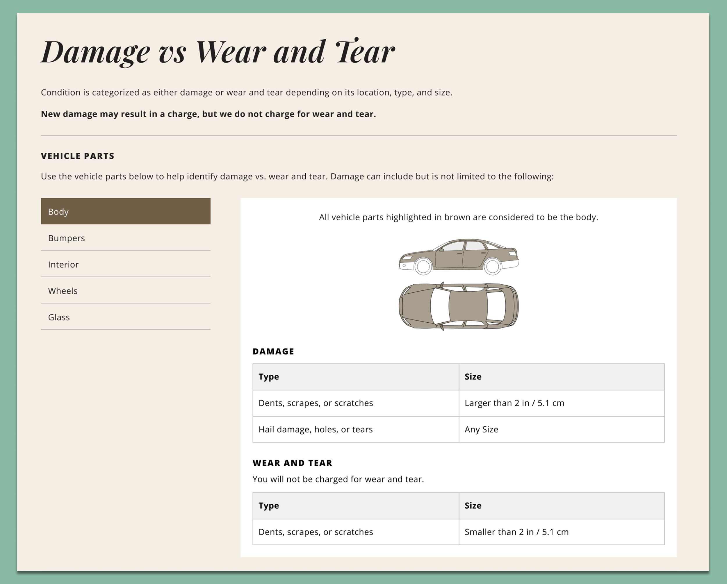
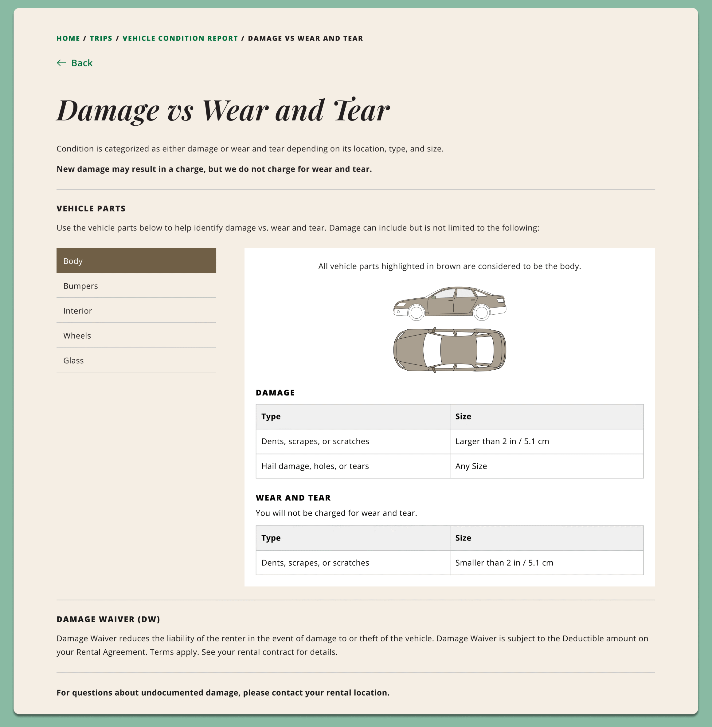
Create a brand new webpage accessible within the Vehicle Condition Report that clearly defines damage vs. wear and tear.
Encourage customers to proactively click into the webpage.
Goal 1: Create a brand new webpage accessible within the Vehicle Condition Report that clearly defines Damage vs. Wear and Tear.
Design Decision #1
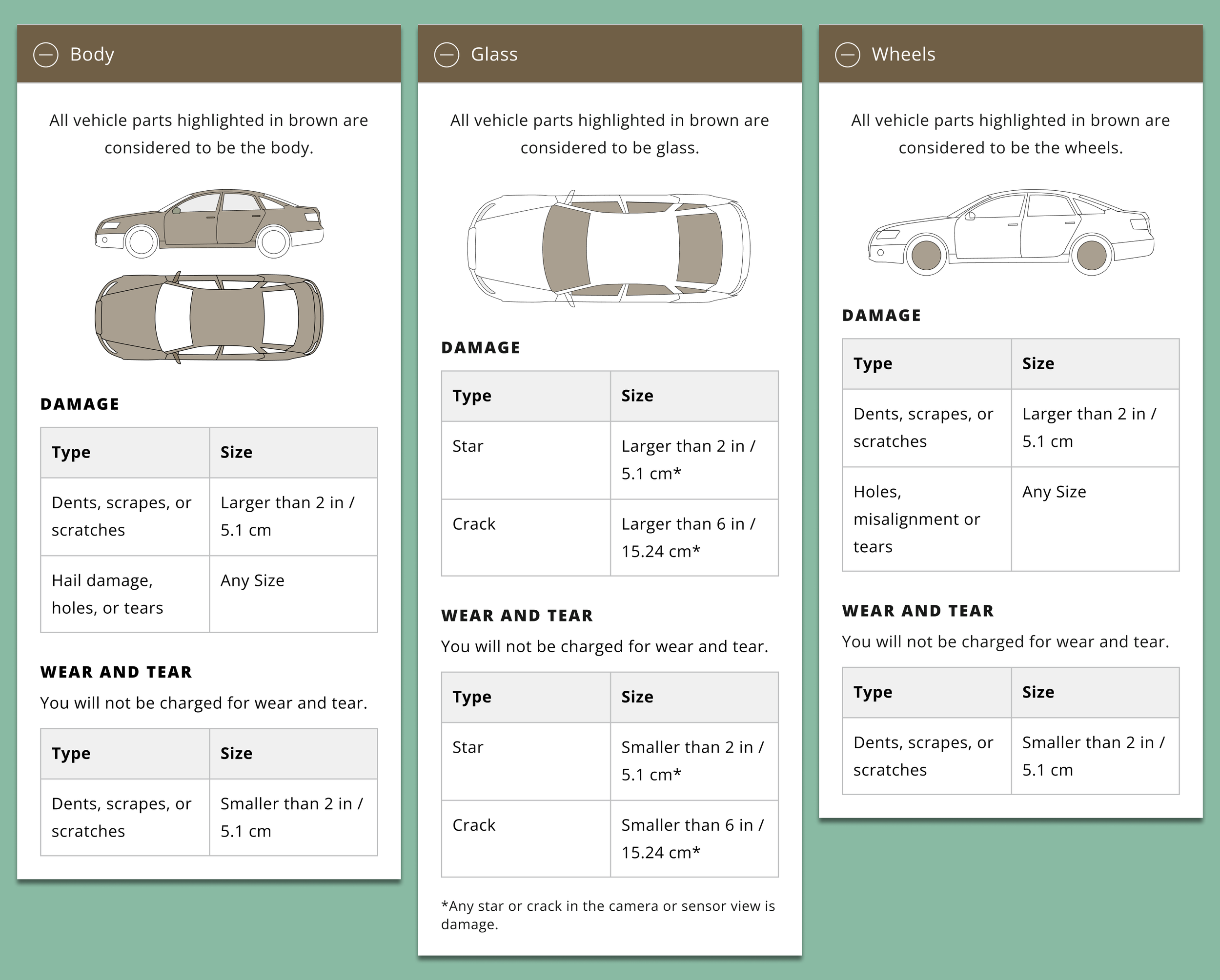
Structure webpage information in an intuitive way for users to quickly find what they need.
We categorized issues as either damage or wear and tear depending on its:
Location on the car
Type
Size
This matched the average user’s mental model when it comes to examining their car’s condition.
Design Decision #2
Make information digestible yet precise.
Content was structured similarly to retail size charts—a familiar format that makes information easy to reference.
The content was organized to be both:
Digestible – Tables visually break down information to allow customers to quickly find what they need.
Precise – Clear measurements, definitions, and visuals help prevent misinterpretation.
This gave customers confidence that they knew how their car would be assessed.
Goal 2: Encourage customers to proactively click into the webpage.
Design Decision #1:
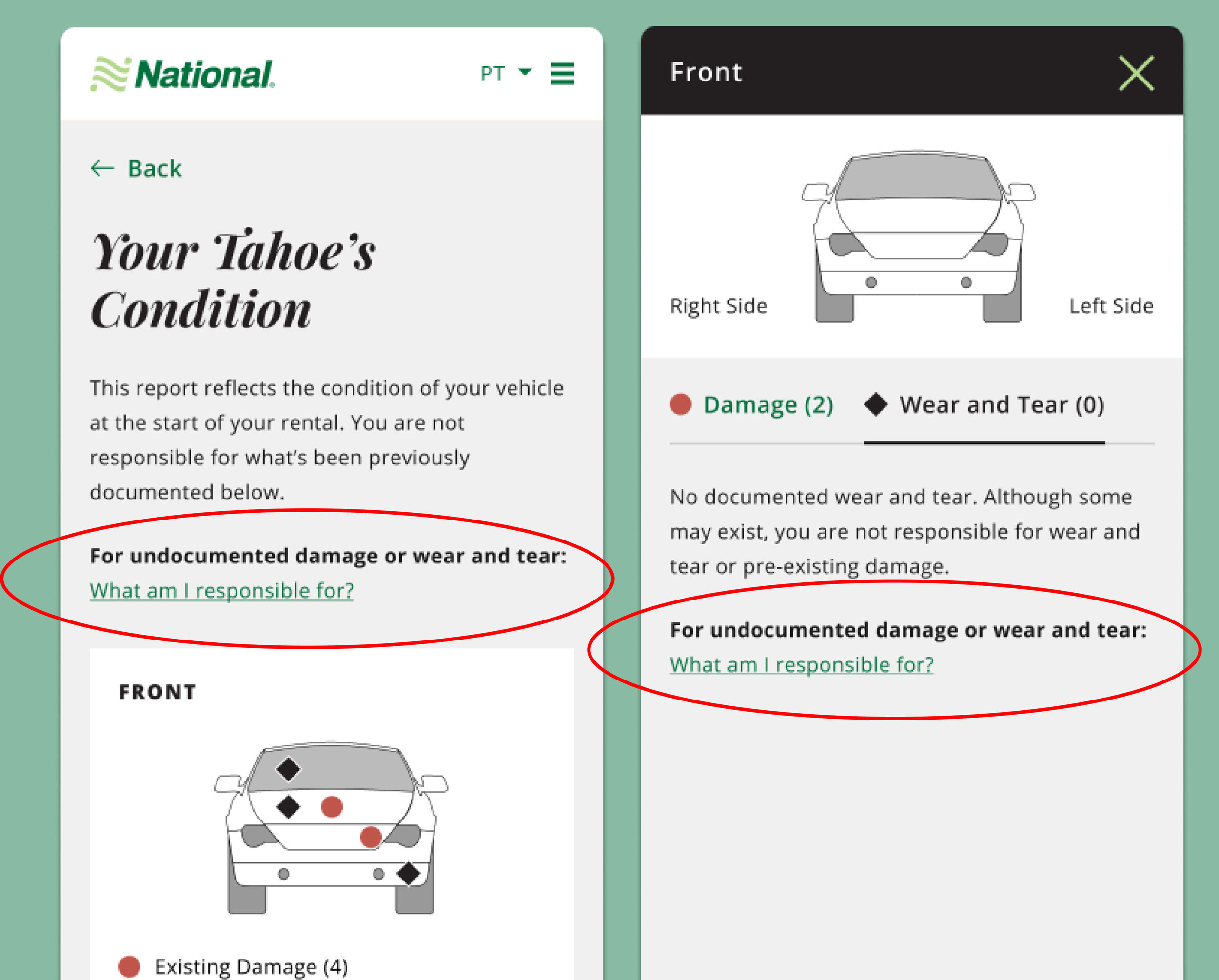
Create clear and compelling entry points into the webpage.
We included two entry points within the vehicle condition report:
An eye-catching question at the top of the report.
A secondary link within the tabbed interface—placed right where customers might feel confused between damage vs wear and tear.
This ensured that customers would always have a clear path to finding answers, ultimately reducing reliance on customer service calls.
Final Product
Educate customers on the difference between damage and wear and tear.
App
Mobile Web
Desktop
D E S I G N T A S K # 3
3. Maximize accessibility and visibility of the report to increase customer awareness and engagement.
Goal:
Redesign the rental agreement email, rental trip dashboard, and past trip receipts to highlight the customer’s vehicle condition report
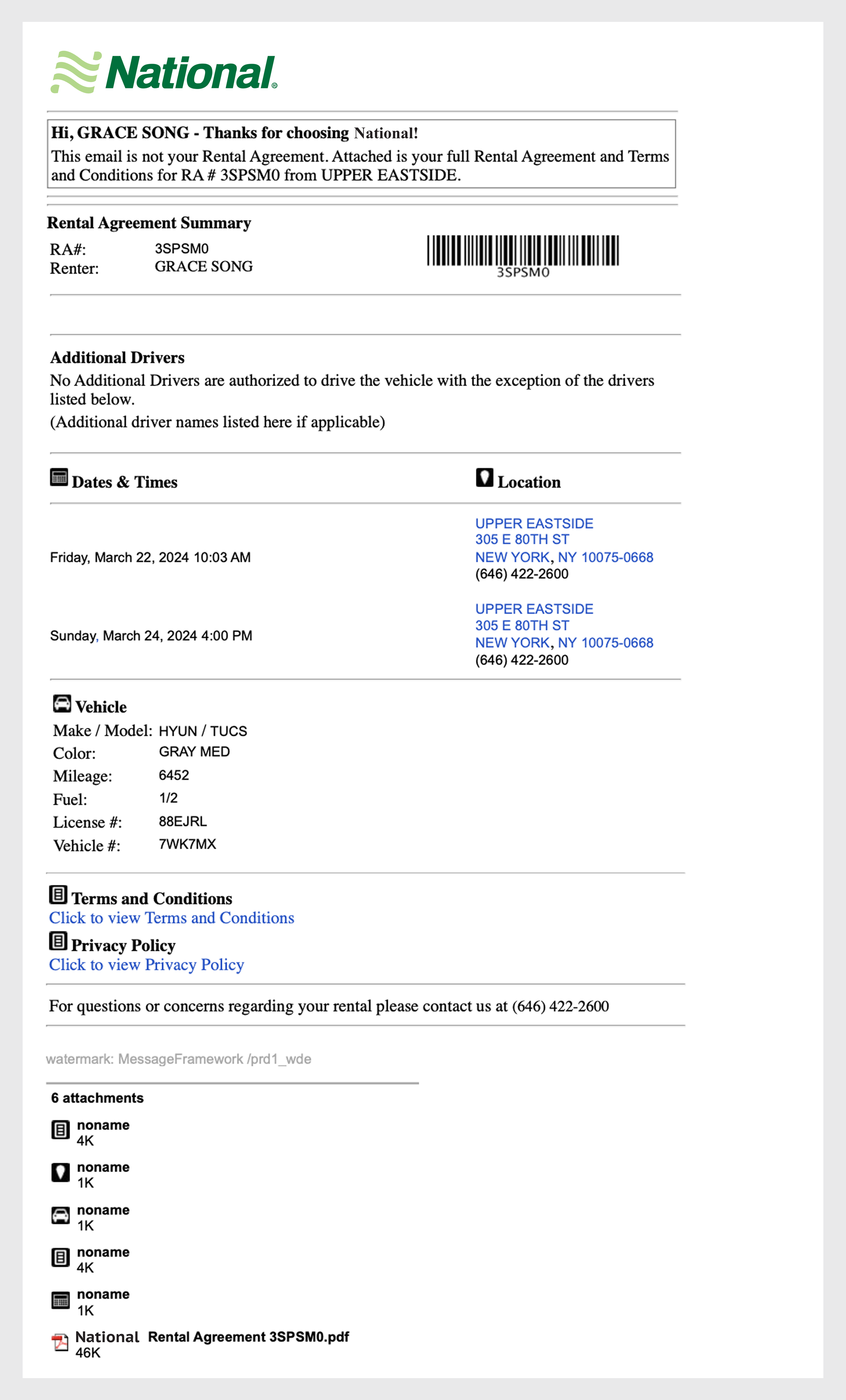
1. Rental Agreement Email
We redesigned the rental agreement email to more prominently feature the car and link directly to the vehicle condition report.
We added a clear call to action encouraging customers to review their car’s condition. This gave customers an early nudge to engage with the report.
Before:
After:
2. Rental Trip Dashboard
We redesigned the trip dashboard to make the car itself the focal point and added a prominent entry point to the vehicle condition report.
By providing a clear, persistent access point in the trip dashboard, we reinforced to customers that the report is part of the trip—not an afterthought.
App: Before vs. After
Mobile Web: Before vs. After

Desktop: Before

Desktop: After
3. Past Trip Receipt
We introduced an access point to the vehicle condition report within each past trip receipt, allowing customers to review photos and documentation even after drop-off.
This provided a valuable audit trail and helped resolve post-trip questions or disputes.
App: Before vs. After
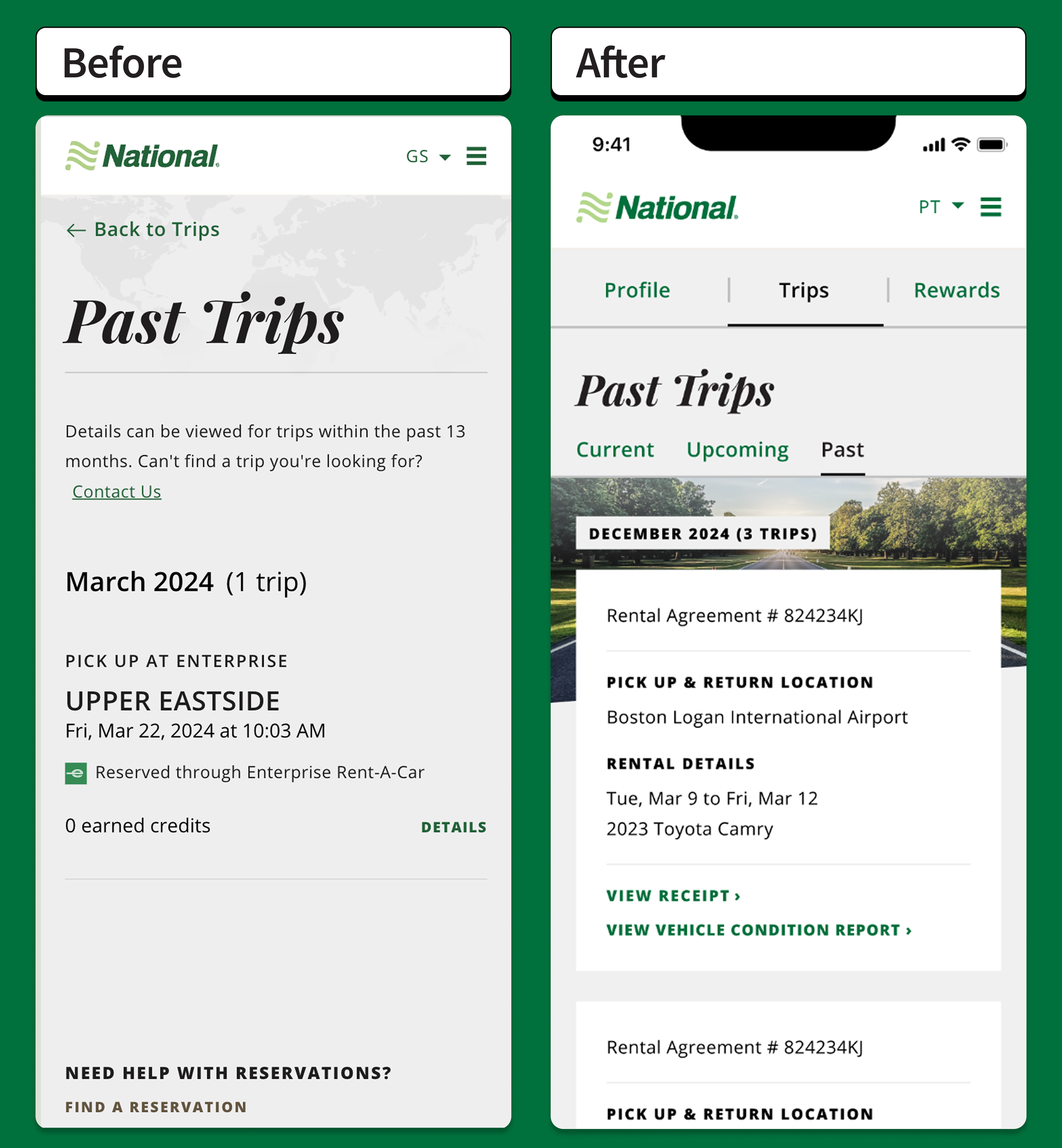
Mobile Web: Before vs. After
Desktop: Before
Desktop: After

C U S T O M E R J O U R N E Y
Customer Experience with the Vehicle Condition Report: Before vs. After
Before Redesign

After Redesign
S H A P I N G T H E D E S I G N S
Research and Testing
All designs were refined through 5 rounds of comprehensive testing including heat mapping, usability testing, and a/b testing.

Constraints
3 major constraints that influenced the final designs
Design constraint
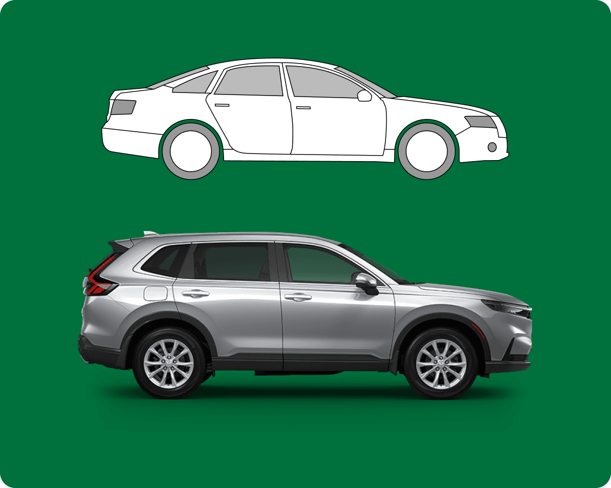
Required by internal leadership to use schematic drawings instead of real car images to represent the vehicles throughout the experience.

Technology constraint
Had to pivot away from designing indicators that looked clickable because our technology did not support users clicking on the car images.

Technology constraint
System did not support customers uploading their own damage photos, so we did not include that feature.
W R A P U P
Reflections
Challenging but fun things I had to figure out in this project:
How to seamlessly integrate a new feature into an existing customer flow in a way that enhances, rather than disrupts their user experience
How to maximize user engagement with “dry” technical vehicle information through a smart mix of diagrams, color coding, accessible language, and simplified steps
How to collaborate effectively with legal and marketing teams to simplify required language and disclaimers in order to continue championing a good user experience
More Projects
Discovery+ Trailer Rail

HumanKind

Ferndalemi.gov
